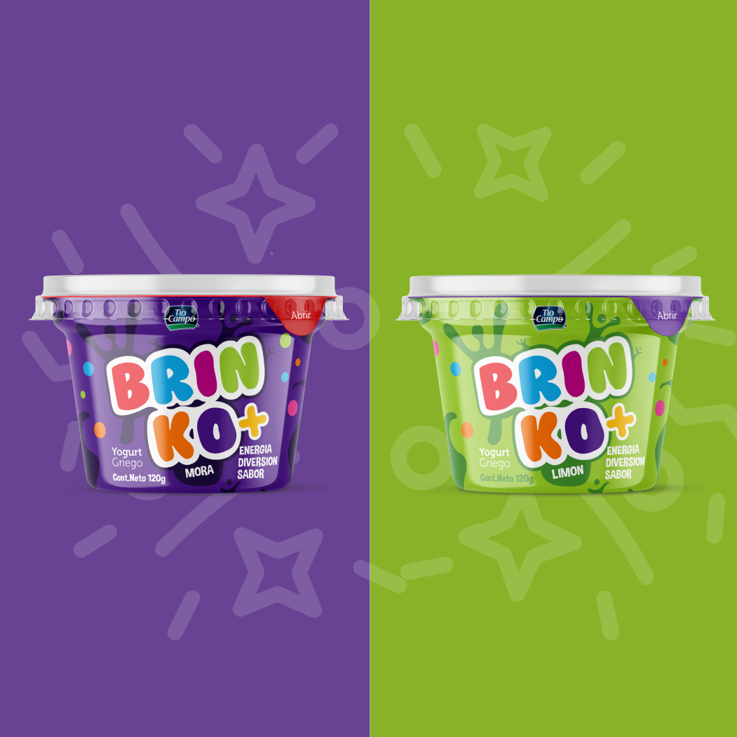
BRINKO+ is a youth-oriented Greek yogurt sub-brand developed under Tío Campo.
The goal was to transform a traditionally adult-positioned product into a vibrant, energetic option that appeals to children while maintaining parental trust. The identity needed to balance fun and nutrition — energy and credibility.